Back to main page
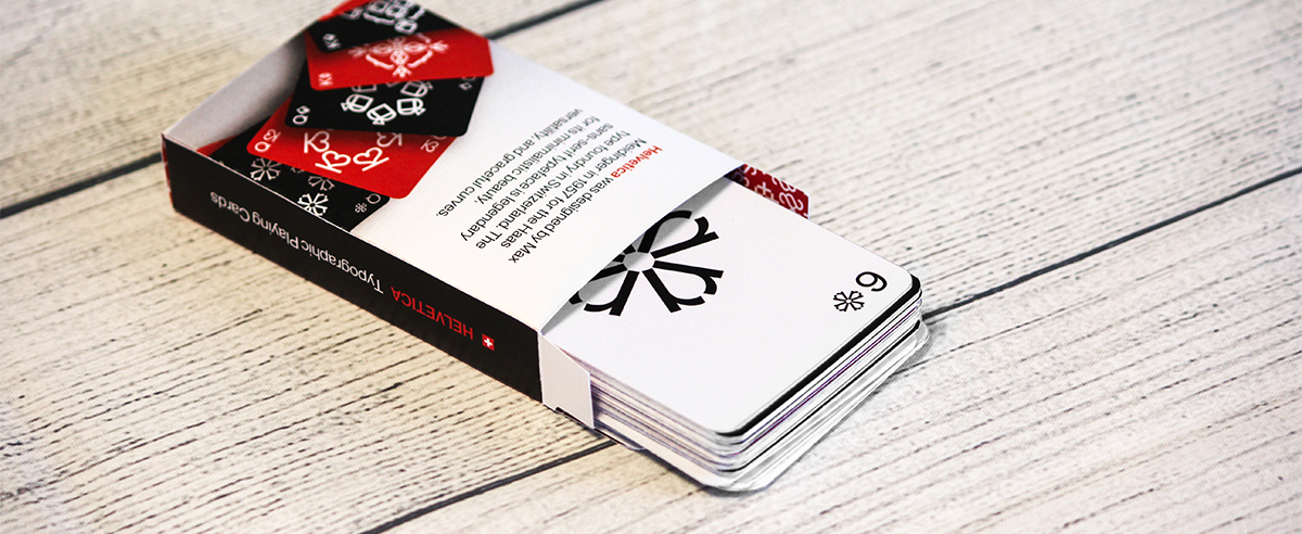


Helveticards
Typography & Package Design

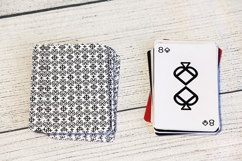
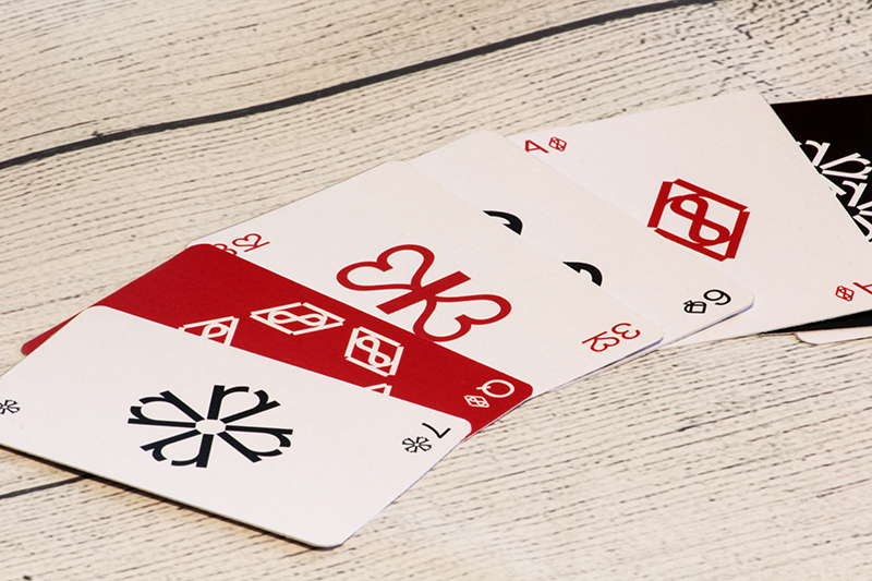
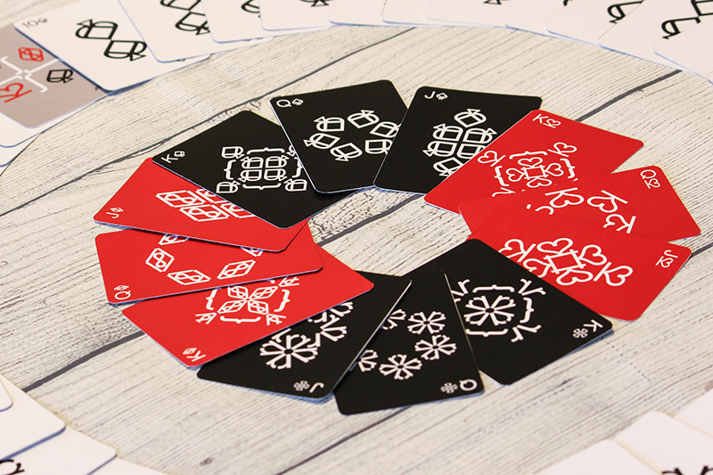
Helvetica is often celebrated (and criticized) as a typeface so functional that it has become nearly invisible. To give creatives (including myself) a fresh appreciation for the typeface, I chose to repeat and mirror Helvetica’s letters and numbers to create designs for each suit symbol in a set of playing cards. Seeing the characters this way helps the viewer to break free from the tendency to simply read the letters, allowing them to appreciate the letterforms through designs that echo the typeface’s graceful curves and balance.
